728x90
반응형
✔ 솔로의 식탁 HTML
<!DOCTYPE html>
<html lang="en">
<head>
<meta charset="UTF-8">
<meta http-equiv="X-UA-Compatible" content="IE=edge">
<meta name="viewport" content="width=device-width, initial-scale=1.0">
<title>솔로의 식탁</title>
<link rel="stylesheet" href="./css/stylr.css">
</head>
<body>
<div id="container">
<header>
<h1>솔로의 식탁</h1>
</header>
<section id ="menus">
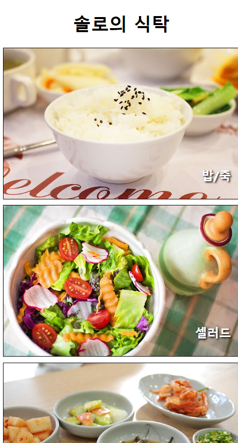
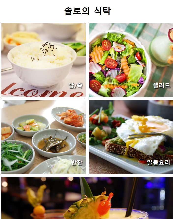
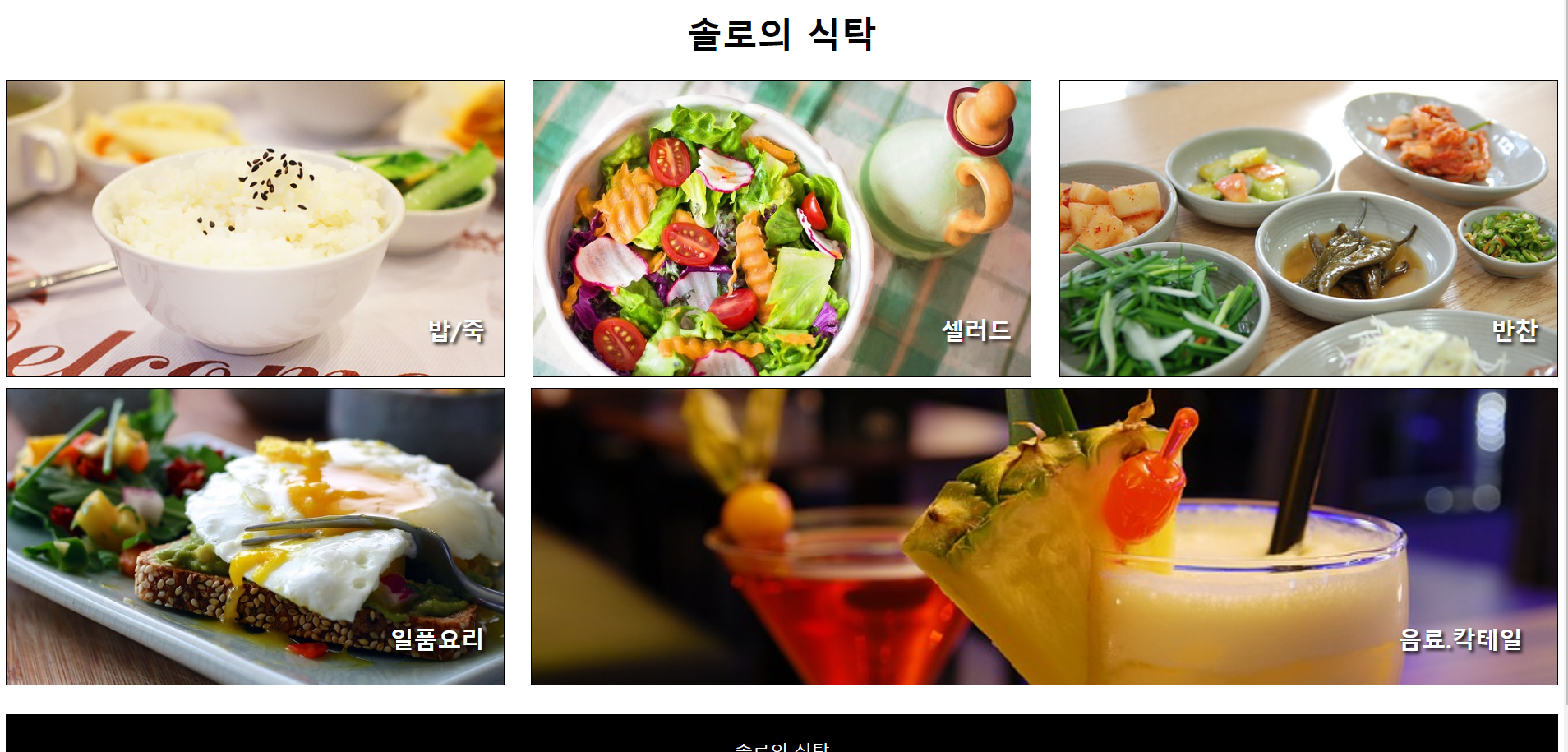
<div id="menue1"><h2>밥/죽</h2></div>
<div id="menue2"><h2>셀러드</h2></div>
<div id="menue3"><h2>반찬</h2></div>
<div id="menue4"><h2>일품요리</h2></div>
<div id="menue5"><h2>음료.칵테일</h2></div>
</section>
<footer>
<p>솔로의 식탁</p>
</footer>
</div>
</body>
</html>
✔ 솔로의 식탁 CSS 휴대폰, 태블릿, 컴퓨터 크기에 따라 설정
@font-face {
font-family: 'Y_Spotlight';
src: url('https://cdn.jsdelivr.net/gh/projectnoonnu/noonfonts-20-12@1.0/Y_Spotlight.woff') format('woff');
font-weight: normal;
font-style: normal;
}
body { font-family: 'Y_Spotlight';}
#container{
width: 100%;
margin: 0 auto;
}
nav {
height: 50px;
background-color: black;
}
nav > ul{
list-style: none;
margin: 0;
padding: 3px;
}
nav > ul >li {
display: inline-block;
margin: 15px 20px;
}
a{text-decoration: none;}
a:link, a:visited {color: white;}
a:active{color: yellow;}
a:hover {color: yellow;}
header {
width: 100%;
height: 300px;
background-image: url(../이미지/header.jpg);
background-repeat: no-repeat;
background-position: center;
background-size: cover;
margin: 0;
}
.photo{
display: none;
}
section{
position: relative;
width: 100%;
padding: 15px 5%;
}
.page-title{
position: absolute;
top: 20px;
left: 0px;
padding: 30px 50px;
}
.content{
margin: 80px auto 10px;
width: 90%;
padding: 20px;
box-sizing: border-box;
}
footer {
position: relative;
width: 100%;
height: 100px;
background-color: black;
}
footer > p{
color: white;
text-align: center;
line-height: 100px;
}
#container section:nth-child(even){
background-color: beige;
}
/*테블릿*/
@media screen and (min-width : 768px) {
header{height: 400px;}
#intro, #map {
box-sizing: border-box;
width: 50%;
float: left;
margin: 0;
height: 300px;
}
#choice {
clear: both;
}
}
/*pc 버전*/
@media screen and (min-width:1024px) {
#container{
width: 1000px;
margin: 0 auto;
}
header {height: 450px;}
#intro, #map, #choice {
box-sizing: border-box;
position: relative;
width: 100%;
height: 400px;
padding: 15px 5%;
}
.photo {
display: block;
width: 40%;
margin-top: 20px;
}
.content{
margin: 80px auto 10px;
width: 90%;
padding: 20px;
}
.photo > img {
width: 100%;
max-width: 320px;
height: auto;
margin-bottom: 30px;
}
#intro .photo, #map .photo{
float: left;
margin-right: 5%;
}
.text {width: 45%;}
#intro .text, #map .text {float: right;}
#choice .photo{
float: right;
}
#choice .text {
float: left;
}
#choice .photo img {border: 1px solid white; border-radius: 50%;}
footer { clear: both;}
}
✔ 카페소개 HTML
<!DOCTYPE html>
<html lang="en">
<head>
<meta charset="UTF-8">
<meta http-equiv="X-UA-Compatible" content="IE=edge">
<meta name="viewport" content="width=device-width, initial-scale=1.0">
<title>솔로의 식탁</title>
<link rel="stylesheet" href="./css/stylr.css">
</head>
<body>
<div id="container">
<header>
<h1>솔로의 식탁</h1>
</header>
<section id ="menus">
<div id="menue1"><h2>밥/죽</h2></div>
<div id="menue2"><h2>셀러드</h2></div>
<div id="menue3"><h2>반찬</h2></div>
<div id="menue4"><h2>일품요리</h2></div>
<div id="menue5"><h2>음료.칵테일</h2></div>
</section>
<footer>
<p>솔로의 식탁</p>
</footer>
</div>
</body>
</html>
✔ 카페소개 CSS 휴대폰, 태블릿, 컴퓨터 크기에 따라 설정
@font-face {
font-family: 'Y_Spotlight';
src: url('https://cdn.jsdelivr.net/gh/projectnoonnu/noonfonts-20-12@1.0/Y_Spotlight.woff') format('woff');
font-weight: normal;
font-style: normal;
}
body { font-family: 'Y_Spotlight';}
#container{
width: 100%;
margin: 0 auto;
}
nav {
height: 50px;
background-color: black;
}
nav > ul{
list-style: none;
margin: 0;
padding: 3px;
}
nav > ul >li {
display: inline-block;
margin: 15px 20px;
}
a{text-decoration: none;}
a:link, a:visited {color: white;}
a:active{color: yellow;}
a:hover {color: yellow;}
header {
width: 100%;
height: 300px;
background-image: url(../이미지/header.jpg);
background-repeat: no-repeat;
background-position: center;
background-size: cover;
margin: 0;
}
.photo{
display: none;
}
section{
position: relative;
width: 100%;
padding: 15px 5%;
}
.page-title{
position: absolute;
top: 20px;
left: 0px;
padding: 30px 50px;
}
.content{
margin: 80px auto 10px;
width: 90%;
padding: 20px;
box-sizing: border-box;
}
footer {
position: relative;
width: 100%;
height: 100px;
background-color: black;
}
footer > p{
color: white;
text-align: center;
line-height: 100px;
}
#container section:nth-child(even){
background-color: beige;
}
/*테블릿*/
@media screen and (min-width : 768px) {
header{height: 400px;}
#intro, #map {
box-sizing: border-box;
width: 50%;
float: left;
margin: 0;
height: 300px;
}
#choice {
clear: both;
}
}
/*pc 버전*/
@media screen and (min-width:1024px) {
#container{
width: 1000px;
margin: 0 auto;
}
header {height: 450px;}
#intro, #map, #choice {
box-sizing: border-box;
position: relative;
width: 100%;
height: 400px;
padding: 15px 5%;
}
.photo {
display: block;
width: 40%;
margin-top: 20px;
}
.content{
margin: 80px auto 10px;
width: 90%;
padding: 20px;
}
.photo > img {
width: 100%;
max-width: 320px;
height: auto;
margin-bottom: 30px;
}
#intro .photo, #map .photo{
float: left;
margin-right: 5%;
}
.text {width: 45%;}
#intro .text, #map .text {float: right;}
#choice .photo{
float: right;
}
#choice .text {
float: left;
}
#choice .photo img {border: 1px solid white; border-radius: 50%;}
footer { clear: both;}
}
반응형
'Frontend > CSS' 카테고리의 다른 글
| CSS(구 GitHub 클린코딩, 미디어쿼리(Media Query)) (0) | 2022.11.12 |
|---|---|
| CSS (transform, animation, transition) (0) | 2022.10.31 |
| CSS( 미디어쿼리, em, rem) (0) | 2022.10.31 |
| CSS (레이아웃 종류, flex 종류) (0) | 2022.10.31 |
| CSS (box-model, padding, margin, border, display, form) (0) | 2022.10.31 |