[ 목차 ]
728x90
반응형
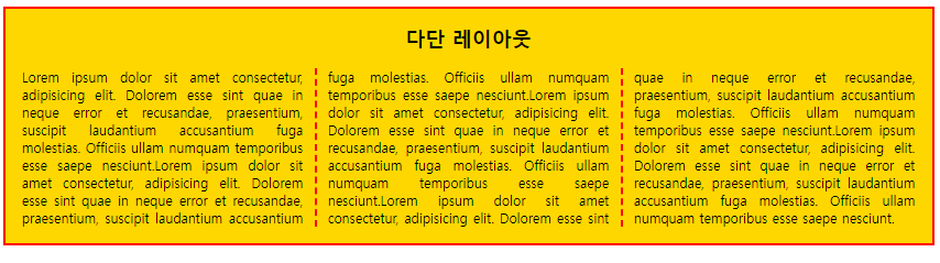
✔ CSS 다단레이아웃
다단 레이아웃
- 텍스트를 column 속성으로 다단을 생성
- 다단은 레이아웃을 여러개의 컬럼으로 쪼개서 구성한다는 의미
- column-count : 단의 갯수를 설정
- column-rule : 단과 간사이의 구분선, 구분의 모양, 두께, 색상을 설정
- column-gap : 단과 단사이의 여백을 설정
- column-span : 단과 안의 포함된 요소를 다단편집에서 해제
✔ CSS 다단레이아웃 코드
<!DOCTYPE html>
<html lang="en">
<head>
<meta charset="UTF-8">
<meta http-equiv="X-UA-Compatible" content="IE=edge">
<meta name="viewport" content="width=device-width, initial-scale=1.0">
<title>다단 레이아웃</title>
<style>
div, h2, p{margin: 0; padding: 0;}
body {margin: 10px;}
h2 {padding: 0 0 20px; text-align: center;}
div.col{
text-align: justify;
padding: 20px;
background-color: gold;
border: 3px solid red;
column-count: 3;/*단을 나누는 기능*/
column-gap: 30px; /*단을 띄우는 기능*/
column-rule: 3px dashed red;/*단의 선을 꾸미는 기능*/
}
.col > h2{column-span: all;} /*컬럼 내부에 있는 요소를 따로 빼는 기능을 의미*/
</style>
<body>
<div class ="col">
<h2>다단 레이아웃</h2>
<p>Lorem ipsum dolor sit amet consectetur, adipisicing elit. Dolorem esse sint quae in neque error et recusandae, praesentium, suscipit laudantium accusantium fuga molestias. Officiis ullam numquam temporibus esse saepe nesciunt.Lorem ipsum dolor sit amet consectetur, adipisicing elit. Dolorem esse sint quae in neque error et recusandae, praesentium, suscipit laudantium accusantium fuga molestias. Officiis ullam numquam temporibus esse saepe nesciunt.Lorem ipsum dolor sit amet consectetur, adipisicing elit. Dolorem esse sint quae in neque error et recusandae, praesentium, suscipit laudantium accusantium fuga molestias. Officiis ullam numquam temporibus esse saepe nesciunt.Lorem ipsum dolor sit amet consectetur, adipisicing elit. Dolorem esse sint quae in neque error et recusandae, praesentium, suscipit laudantium accusantium fuga molestias. Officiis ullam numquam temporibus esse saepe nesciunt.Lorem ipsum dolor sit amet consectetur, adipisicing elit. Dolorem esse sint quae in neque error et recusandae, praesentium, suscipit laudantium accusantium fuga molestias. Officiis ullam numquam temporibus esse saepe nesciunt.</p>
</div>
</body>
</html>
✔ CSS 다단레이아웃 결과
✔ CSS Flex 레이아웃
❗ Flex 레이아웃 ❗ - (가로정렬하는 방법 종류 - 테이블, float, flex, grid)
- css3에 새롭게 추가되었음
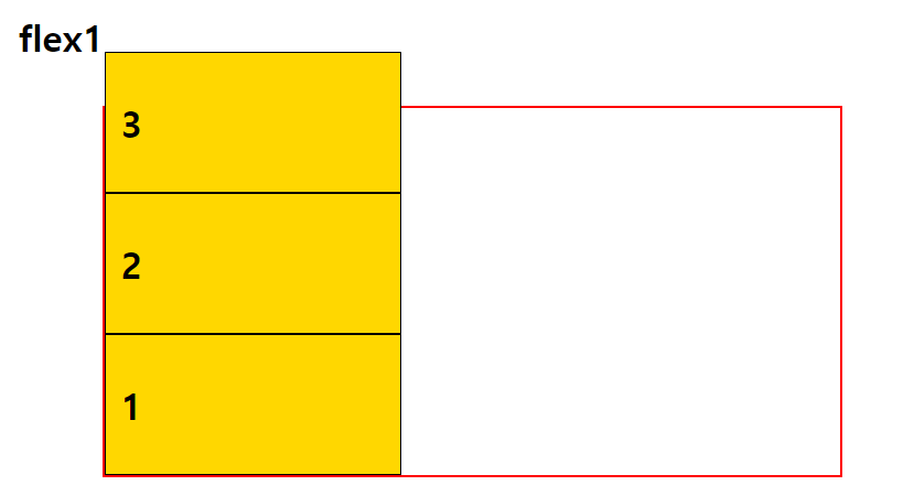
- display : flexflex-wrap
플랙스 라인에 여유가 없을 때 플렉스 요소의 위치를 결정하는 속성
nowrap : 기본값, 플랙스 요소가 다음줄로 넘어가지 않음. 요소의 너비를 줄여 한 줄에 배치
wrap : 플렉스 요소의 여유 공간이 없다면 다음줄로 넘김
wrap-reverce : 플랙스 요소의 여유 공간이 없다면 다음줄로 넘김(단, 아래쪽이 아닌 위쪽으로 넘김)✔ CSS Flex1 코드
<!DOCTYPE html>
<html lang="en">
<head>
<meta charset="UTF-8">
<meta http-equiv="X-UA-Compatible" content="IE=edge">
<meta name="viewport" content="width=device-width, initial-scale=1.0">
<title>flex1</title>
<style>
/*flex를 사용하기 위한 요소를 감싸는 container가 있어야 하며 그 안의 아이템들이 필요하다. -> html부분과 유사하게!*/
#container{
width: 1000px;
height: 500px;
margin: 0 auto;
border: 3px solid red;
display: flex;
flex: nowrap; /*다음줄로 넘기지 않음 */
/* flex-wrap: wrap; 여유공간이 없다면 밑으로 내림*/
/*flex-wrap: wrap-reverse; 여유공간이 없다면 위로 올리는 기능*/
/* flex-direction: row; */
/* flex-direction: column; */
/* flex-direction: row-reverse; */
flex-direction: column-reverse;
}
#container > div{
width: 400px;
border: 1px solid black;
background-color: gold;
}
h2{
font-size: 50px;
font-weight: bold;
padding: 20px;
}
</style>
</head>
<body>
<h2>flex1</h2>
<div id="container">
<div id="box1"><h2>1</h2></div>
<div id="box2"><h2>2</h2></div>
<div id="box3"><h2>3</h2></div>
</div>
</body>
</html>
✔ CSS Flex1 결과
✔ CSS Flex
flex-direction
플렉스 요소들이 배치되는 축의 방향을 결정하는 속성
row : 기본값, 가로로 배치
row-reverse : 가로로 배치(반대로)
column : 세로로 배치
column : 세로로 배치(반대로)
flex-flow
flex-wrap과 flex-direction을 한꺼번에 지정할 수 있는 속성
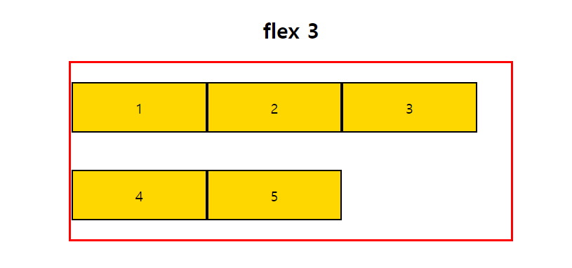
예) flex-flow : row nowrapjustify-content
플렉스 요소의 수평방향 정렬방식을 설정
flex-start : 기본값, 앞쪽에서부터 배치됨
flex-end : 뒤쪽에서부토 배치됨
center : 가운데 배치됨
space-between : 요소들 사이에 여유 공간을 두고 배치됨(앞뒤 양쪽에 요소를 붙임)
space-around : 요소들 사이에 여유 공간을 두고 배치됨(앞뒤 약간의 공간을 둠)align-items
플렉스 요소의 수직방향 정렬 방식을 설정
stretch : 기본값, 아이템들이 수직축 방향으로 늘어남
flex-start : 요소들이 시작점으로 정렬됨
flex-end : 요소들이 끝으로 정렬됨
center : 요소들이 가운데로 정렬됨
baseline : 요소들을 텍스트 베이스라인 기준으로 정렬됨align-content
flex-wrap : wrap 설정된 상태에서 아이템들이 행이 2줄 이상 되었을 때의 수직축 방향 정렬을 결정하는 속성
stretch : 기본값. 위 아래로 늘어남
flex-start : 요소들이 시작점으로 정렬됨
flex-end : 요소들이 끝으로 정렬됨
center : 요소들이 가운데로 정렬됨
space-between : 요소들 사이에 여유 공간을 두고 배치됨(앞뒤 양쪽에 요소를 붙임)
space-around : 요소들 사이에 여유 공간을 두고 배치됨(앞뒤 약간의 공간을 둠)align-self
플렉스 요소에 수직축으로 다른 align 속성값을 설정(개별적으로 줌)✔ CSS Flex 예제 코드
<!DOCTYPE html>
<html lang="en">
<head>
<meta charset="UTF-8">
<meta http-equiv="X-UA-Compatible" content="IE=edge">
<meta name="viewport" content="width=device-width, initial-scale=1.0">
<title>flex 3</title>
<style>
.wrapper {
width: 500px;
height: 200px;
margin: 0 auto;
display: flex ;
border: 3px solid red;
}
.wrapper div{/*flex nowrap 때문에 커도 맞춰짐*/
width: 150px;
border: 2px solid black;
background-color: gold;
}
#container{
flex-wrap: wrap;
/* align-content: stretch; */
/* align-content: flex-start; */
/* align-content: flex-end; */
/* align-content: center; */
/* align-content: space-between; */
align-content: space-around;
}
h2, p{
text-align: center;
}
</style>
</head>
<body>
<h2>flex 3</h2>
<div id="container" class ="wrapper">
<div>
<p>1</p>
</div>
<div>
<p>2</p>
</div>
<div>
<p>3</p>
</div>
<div>
<p >4</p>
</div>
<div>
<p>5</p>
</div>
</div>
</body>
</html>
✔ CSS Flex 예제 결과
order
플렉스 요소들의 순서를 설정 ((ex) order : 1)
✔ CSS Flex 예제 코드
<!DOCTYPE html>
<html lang="en">
<head>
<meta charset="UTF-8">
<meta http-equiv="X-UA-Compatible" content="IE=edge">
<meta name="viewport" content="width=device-width, initial-scale=1.0">
<title>flex 2</title>
<style>
.wrapper {
width: 500px;
height: 200px;
margin: 0 auto;
display: flex;
border: 3px solid red;
}
.wrapper div{
width: 50px;
border: 2px solid black;
background-color: gold;
}
#container{
justify-content: flex-start; /*기본 값 */
/* justify-content: flex-end; */
/* justify-content: center; */
/* justify-content: space-between; 여유공간 */
/* justify-content: space-around; */
/* align-items: stretch; 기본값*/
/* align-items: flex-start; 위로*/
/* align-items: flex-end; 아래로*/
/* align-items: center; */
align-items: baseline;
}
h2, p{
text-align: center;
}
#box1 {order: 5;}
#box2 {order: 3;}
#box3 {order: 2;}
#box4 {order: 1;}
#box5 {order: 4;}
#box2{align-self: flex-end;}
#box1{align-self: flex-start;}
</style>
</head>
<body>
<h2>flex 2</h2>
<div id="container" class ="wrapper">
<div id ="box1">
<p>1</p>
</div>
<div id = "box2">
<p>2</p>
</div>
<div id ="box3">
<p>3</p>
</div>
<div id ="box4">
<p style="font-size: 50px;">4</p>
</div>
<div id ="box5">
<p>5</p>
</div>
</div>
</body>
</html>
✔ CSS Flex 예제 결과

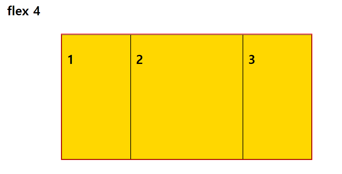
flex
flex-grow, flex-shrink, flex-basis를 한 번에 쓸 수 있는 속성
✔ CSS Flex 예제 코드
<!DOCTYPE html>
<html lang="en">
<head>
<meta charset="UTF-8">
<meta http-equiv="X-UA-Compatible" content="IE=edge">
<meta name="viewport" content="width=device-width, initial-scale=1.0">
<title>flex 4</title>
<style>
#container{
width: 1000px;
height: 500px;
margin: 0 auto;
border: 3px solid red;
display: flex;
flex: nowrap;
}
#container > div{
width: 400px;
border: 1px solid black;
background-color: gold;
}
h2{
font-size: 50px;
font-weight: bold;
padding: 20px;
}
.item {
/* flex-basis: auto;기본값 auto */
flex-basis: 100px;/*글자가 커저 선언값을 넘어가면 그 부분은 그냥 넘어간다*/
/* word-wrap: break-word; */
/* flex-grow: 1; */
}
/*비율로 크기를 지정한다. flex-grow 2 와 같이*/
.item:nth-child(1){flex-grow: 1; flex-shrink: 1;}
.item:nth-child(2){flex-grow: 2; flex-shrink: 1;}
.item:nth-child(3){flex-grow: 1; flex-shrink: 1<span style="colo
✔ CSS Flex 예제 결과
반응형
'Frontend > CSS' 카테고리의 다른 글
| CSS (transform, animation, transition) (0) | 2022.10.31 |
|---|---|
| CSS( 미디어쿼리, em, rem) (0) | 2022.10.31 |
| CSS (box-model, padding, margin, border, display, form) (0) | 2022.10.31 |
| CSS 위치지정(상대, 절대, 고정, float, clear, z-index) (0) | 2022.10.31 |
| CSS 배경 종류 (0) | 2022.10.31 |


