728x90
반응형
✔ CSS 배경
CSS 배경

background-color
HTML 요소의 배경색을 설정
✔ CSS 배경 코드
<!DOCTYPE html>
<html lang="en">
<head>
<meta charset="UTF-8">
<meta http-equiv="X-UA-Compatible" content="IE=edge">
<meta name="viewport" content="width=device-width, initial-scale=1.0">
<title>CSS 배경 1</title>
<style>
body {background-color: deepskyblue;}
div {background-color: white;width: 60%;padding: 20px;border: 3px dotted red;}
</style>
</head>
<body>
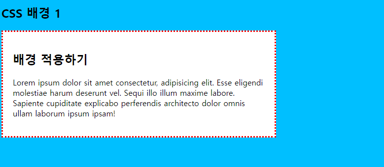
<h2>CSS 배경 1</h2>
<div>
<h2>배경 적용하기</h2>
<p>Lorem ipsum dolor sit amet consectetur, adipisicing elit. Esse eligendi molestiae harum deserunt vel. Sequi illo illum maxime labore. Sapiente cupiditate explicabo perferendis architecto dolor omnis ullam laborum ipsum ipsam!</p>
</div>
</body>
</html>
✔ CSS 배경 결과
✔ CSS 배경2
background-image
HTML 요소의 배경으로 나타날 배경 이미지를 설정, 배경 이미지는 기본 설정으로 반복되어 나타남

    background-image: url(파일경로)
✔ CSS 배경2 코드
<!DOCTYPE html>
<html lang="en">
<head>
<meta charset="UTF-8">
<meta http-equiv="X-UA-Compatible" content="IE=edge">
<meta name="viewport" content="width=device-width, initial-scale=1.0">
<title>CSS 배경 2</title>
<style>
body {
background-image: url(./star.png);
background-repeat: no-repeat;
}
</style>
</head>
<body>
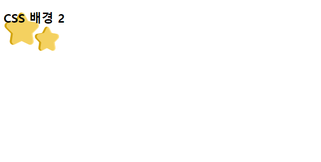
<h2>CSS 배경 2</h2>
</body>
</html>
✔ CSS 배경2 결과
✔ CSS 배경3
background-repeat
배경 이미지를 수평이나 수직방향으로 반복하도록 설정
- repeat-X, repeat-y, no-repeat

background-position
- 반복되지 않는 배경 이미지의 상대 위치를 설정
- %나 px을 사용해서 상대위치응 직접 설정할 수 있음
- 상대 위치를 결정하는 기준은 왼쪽 상단9left top)

    left top        center top      right top
    left center     center          right center
    left bottom     center bottom   right bottom

    background-position : center bottom

    background-position : 가로위치값 세로 위치값
    background-position : 10% 100px

background-attachment
- 위치가 설정된 배경 이미지를 원하는 위치에 고정시킬 수 있음
- 고정된 배경 이미지는 스크롤과 무관하게 화면의 위치에서 이동되지 않음
✔ CSS 배경3 코드
<!DOCTYPE html>
<html lang="en">
<head>
<meta charset="UTF-8">
<meta http-equiv="X-UA-Compatible" content="IE=edge">
<meta name="viewport" content="width=device-width, initial-scale=1.0">
<title>CSS 배경 3</title>
<style>
body {
background-image: url(./star.png);
background-repeat: no-repeat;
background-position: right bottom;
background-attachment: fixed ;
}
div {
width:60%;
height:300px;
border: 3px dotted deeppink;
padding: 10px;
margin-bottom: 20px;
background-image: url(./star.png);
background-repeat: no-repeat;
}
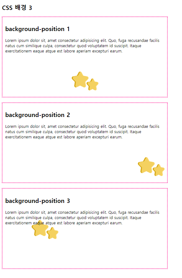
.bg1 {background-position: center bottom;}
.bg2 {background-position: right bottom;}
.bg3 {background-position: 20% 100px ;}
</style>
</head>
<body>
<h2>CSS 배경 3</h2>
<div class="bg1">
<h2>background-position 1</h2>
<p>Lorem ipsum dolor sit, amet consectetur adipisicing elit. Quo, fuga recusandae facilis natus cum similique culpa, consectetur quod voluptatem id suscipit. Itaque exercitationem eaque atque est labore aperiam excepturi earum.</p></div>
<div class="bg2">
<h2>background-position 2</h2>
<p>Lorem ipsum dolor sit, amet consectetur adipisicing elit. Quo, fuga recusandae facilis natus cum similique culpa, consectetur quod voluptatem id suscipit. Itaque exercitationem eaque atque est labore aperiam excepturi earum.</p></div>
<div class="bg3">
<h2>background-position 3</h2>
<p>Lorem ipsum dolor sit, amet consectetur adipisicing elit. Quo, fuga recusandae facilis natus cum similique culpa, consectetur quod voluptatem id suscipit. Itaque exercitationem eaque atque est labore aperiam excepturi earum.</p>
</div>
</body>
</html>
✔ CSS 배경3 결과
✔ CSS 배경4
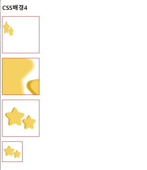
background-size
- 배경 이미지 크기를 설정
- px, %를 사용
- contain
    배경 이미지의 가로, 세로 모두 요소보다 작다는 조건하에 가능한 설정
    가로, 세로 비율은 유지
    배경 이미지의 크기는 요소의 크기보다 항상 작거나 같음
- cover
    배경 이미지의 가로, 세로, 길이 모두 요소보다 크다는 조건하에 가능한 설정
    배경 이지미의 크기는 요소의 크기보다 항상 크거나 같음

//background-size 스네이크 표기법, backgroundSize 카넬표기법
✔ CSS 배경4 코드
<!DOCTYPE html>
<html lang="en">
<head>
<meta charset="UTF-8">
<meta http-equiv="X-UA-Compatible" content="IE=edge">
<meta name="viewport" content="width=device-width, initial-scale=1.0">
<title>CSS배경4</title>
<style>
div {
background-image: url(./star.png);
background-repeat: no-repeat;
width: 150px;
height: 150px;
border: 2px solid red;
margin-bottom: 20px;
}
.background1 { background-size: 50px 100px;}
.background2 { background-size: 500px 500px; background-position: center;}
.background3 { background-size: contain;}/*넣고자 하는 공간의 크기보다 작다는 가정하에 비율에 맞춰 이미지를 삽입해주는 것을 contain이라고 한다.*/
.background4 {
width: 80px;
height: 80px;
background-size: cover;
}/*cover : 들어갈 공간보다 이미지의 크기가 더 클경우 사용하며 비율에 맞게 작용하고 남는 위아레를 안보이게 한다. 이미지 사용간 covor 사용*/
</style>
</head>
<body>
<h2>CSS배경4</h2>
<div class="background1"></div>
<div class="background2"></div>
<div class="background3"></div>
<div class="background4"></div>
</body>
</html>
✔ CSS 배경4 결과
✔ CSS 배경5
background
배경 속성을 한번에 적용
background 파일위치 반복여부 위치 사이즈...
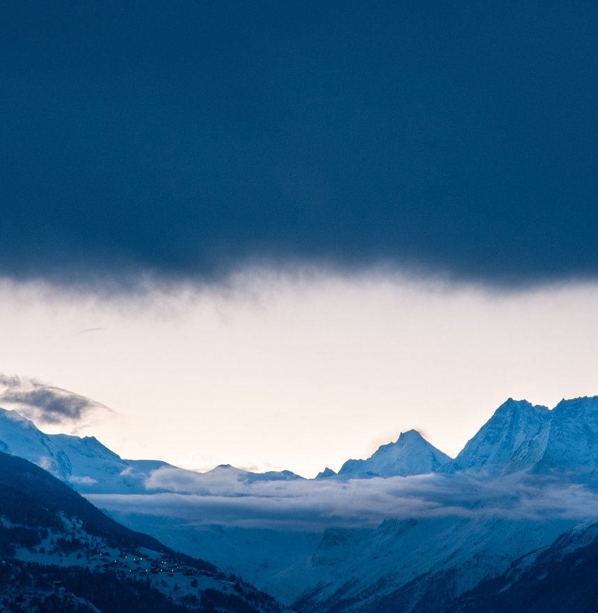
무료 JPG 사이트 - 픽사베이 https://pixabay.com/ko/ ✔ CSS 배경5 코드
<!DOCTYPE html>
<html lang="en">
<head>
<meta charset="UTF-8">
<meta http-equiv="X-UA-Compatible" content="IE=edge">
<meta name="viewport" content="width=device-width, initial-scale=1.0">
<title>CSS 배경 5</title>
<style>
html{
background: url(./mountin.jpg) no-repeat center fixed;
background-size: cover;
}
</style>
</head>
<body>
</body>
</html>
✔ CSS 배경5 결과
반응형
'Frontend > CSS' 카테고리의 다른 글
| CSS (box-model, padding, margin, border, display, form) (0) | 2022.10.31 |
|---|---|
| CSS 위치지정(상대, 절대, 고정, float, clear, z-index) (0) | 2022.10.31 |
| CSS 텍스트 종류 (0) | 2022.10.27 |
| CSS 선택자(그룹, 자손, 자식, 일반 형제, 인접 형제, 속성, 가상) (0) | 2022.10.27 |
| CSS (상속, 전체/ id /class 선택자) (0) | 2022.10.26 |